Web Design Tips Tied To Brick-and-Mortar Stores
July 31, 2018
People like to talk about the real world and the virtual world, but the fact is … it’s one world. If you think about your experiences in brick-and-mortar stores, you quickly realize why web design best practices are what they are. To illustrate:
- Darkly lit stores make it hard to find what you need, and also create a rather creepy atmosphere. In the same way, poor contrast between text and background (especially light text on dark backgrounds) discourages website visitors.
- Long checkout lines annoy customers, and the very sight of them may send foot traffic right out the door again. In the same way, lengthy inquiry forms, lengthy checkout processes and slow-loading web pages turn off visitors in a big way.
- Don’t you love self-checkout stations? They help you avoid those long checkout lines. In the same way, one-click checkout, express checkout, one-click inquiry forms and other website processes designed for convenience reel in leads and online revenue.
- What about store cashiers who are rude, inattentive and/or unknowledgeable? How does that make you feel about coming back for repeat purchases? In the same way, website content that is condescending, impersonal, vague and/or inaccurate destroys your credibility and makes indifferent or interested prospects downright hostile.
- Whether or not you do it, you’ll notice brick-and-mortar stores are crawling with coupon clippers, app checkers and deal searchers of all kinds. In the same way, websites with relevant and enticing offers attract the attention of visitors who are eager to purchase and are just looking for an excuse.
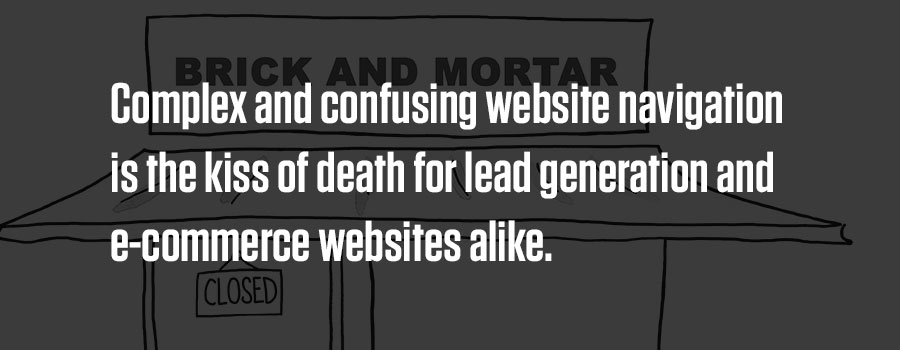
- If wandering around a 150,000-square-foot superstore trying to find a box of nails is like looking for a needle in a haystack, the next thing you’re sure to be looking for is another hardware store. In the same way, complex and confusing website navigation is the kiss of death for lead generation and e-commerce websites alike.
- Wide aisles are the brick-and-mortar equivalent of white space on a web page. They make visitors comfortable and willing to linger, learn, shop, inquire and buy.
All of these comparisons revolve around one thing: maximizing the visitor’s experience.
People behave like people whether they’re in a store or online. They have the same reactions to the same stimuli. It’s dangerous to ignore this when designing a website, which companies do when they prioritize fancy design, budgeting or some other factor ahead of user experience. It’s our job as web design specialists to keep that from happening with our clients.
We deliver! Sign up and we’ll send our valuable content right to your inbox.