
5 Quick Design Tips For Conversion Elements And Forms
February 11, 2016
One thing a lead generation website should do is convert! Here are five design ideas that work for us.
1. Use a fixed header or footer with main call to action.

- Can have it slide in and out to catch the user’s eye.
- Remains in the user’s view at all times, in case he/she is ready to reach out.
2. Don’t overwhelm the user with too many options.

- The “keep it simple, stupid” phrase is something I try to remind myself regularly while laying out a design.
- White space plays a large role in this. Jamming different things for the user to do into one space will only cause confusion and anxiety. Give the user one or two conversion options, at most.
3. CTA button colors matter.

- Don’t change the main call to action (CTA) button color throughout the site.
- CTA buttons should be a color that stands out from the rest of the colors on your site, but still must maintain the branding and color scheme.
4. Tell users what you want them to do.

- Don’t make it a mystery where you want them to go and what you want them to see.
- Figure out your most important call to action and how to get them there the easiest way possible.
5. Keep your form fields to a minimum.
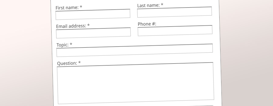
- Sure, it would benefit your sales process to get as much info as possible on a potential customer. But if you got no information, is that better? Usually, just getting the customer to raise his/her hand is enough.
- A “quick form” attached above the footer — or throughout the site — can be a great way to get someone to sign up for a newsletter without asking for too much info.
- If you provide users with something that benefits them, or increases their knowledge of a subject, it will give them incentive to submit the form — a free PDF download works terrifically.
We deliver! Sign up and we’ll send our valuable content right to your inbox.