
Common Form Issues And Their Impact On Lead Generation
Having been in the business of developing/redeveloping websites for about a decade, I have come across some forms that are done perfectly and others that make me scratch my head. It makes me wonder what the form creator was thinking and how many leads that company lost because of its website forms. Not everyone puts a lot of thought into forms — so if you are one of these people, I recommend changing that habit ASAP.
Entire books — spanning hundreds of pages — have been written about Web forms and how best to design and develop them. Entire websites are also devoted to Web forms, and they will give you a feel for just how angry forms can make users. Our team is not here to delve deeply into all of that, but we’d like to share some of the most common issues we see on forms every day — so that you can avoid making the same mistakes on your website.
Poor User Interface

Poorly designed forms are killers. They make people think about how to complete your forms, and for someone who might be on the fence about contacting you, this could be a deal breaker. If a user gets frustrated filling out your form, he will bail, costing you a lead. This isn’t the place to get artistic or to try new techniques — stick with a simple, clean form with a good call to action and a “submit” button that stands out. Also, put some text on the page, prior to the form submission. This lets the user know what he can expect.
Some good UI choices to make when laying out a form are:
- Place the form labels above each form field, rather than to the side. Studies show this is the most effective way for the human eye to scan the form, and it is the easiest layout to understand.
- Put your form fields in a logical order. For instance, you always see city, state and ZIP together — in that order. No need to re-arrange them, as your users should already be familiar with entering data in that structure.
- Use conditional form fields to hide and show fields, as necessary. This will keep the form from appearing longer than it needs to be, making it easier for users to fill out.
Too Many Form Fields
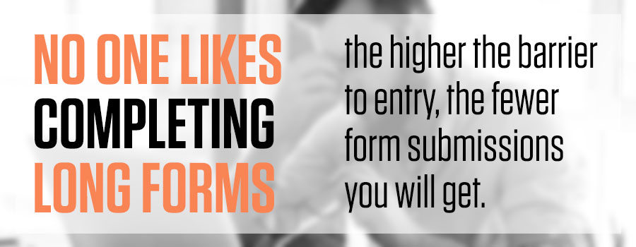
This one isn’t rocket science. Keep form fields to a minimum. I understand that you might want to get more information from the user at this point, but now is not the time. Get his name, email address and phone number before you lose him. After obtaining that, your sales team can get the rest of his information via phone or email. The most important objective at this point is to capture the main contact info before he changes his mind. No one likes completing long forms — the higher the barrier to entry, the fewer form submissions you will get.
Multistep Forms
Yikes. See the statement above regarding too many form fields. I’d rather stick a pencil in my eye than fill out one of these. Stay away from these at all costs on a lead generation form.
Poorly Marked Required Fields
A lot of forms have no indication of what fields are required, or they use a nonstandard method of denoting this. The red required asterisk (*) has been a Web standard for many years, and it should stay that way. Users who see this are able to quickly and easily identify which fields are required without having to think about it. This is key.
There is nothing more frustrating than getting a form error for a required field that wasn’t marked as required, or that you didn’t know was required. I’ve left forms unsubmitted as a result. Your users will, too, if your forms are designed this way.
Syntax Checking
Another common problem with forms is failure to indicate required syntax (phone numbers, zip code, etc.) on a specific form field. When you have form fields that require data to be entered in a specific format, you need to show the users an example of this format. Phone numbers are a perfect example. There are many ways to enter a phone number, and if you don’t show the user how you want it, he will likely struggle to input the information correctly. Ex: 123-456-7890, (123) 456-7890 or 1234567890. If you are going to require specific phone syntax, display it above or below the form field in a format like this: XXX-XXX-XXXX. Users will quickly understand that is the format you want them to follow.
However, my suggestion (and one that we’ve implemented on our website) is to remove syntax checking from phone number fields altogether. Just because syntax checking is in place doesn’t mean someone won’t enter 55-555-5555 into the field. If the user is genuinely interested in the service you are offering or the product you are selling, he will make sure to enter his phone number into the form field correctly.
Unclear Error Messages
Even though I could write a book about this, I won’t spend a lot of time on this topic. Simply use common sense. It is very important that users easily understand error messages. If they did not fill out a required field, make sure they know which field needs to be completed. If they did not input something in the proper format, make sure they know what field has the issue and the proper format required. Making error messages as clear as possible will eliminate user frustration. It will also increase the number of users that are able to successfully contact you.
By avoiding these common form design pitfalls, you will ensure that your forms are built for success, which will help to increase your conversion rate and gain more sales leads.