
Microsite Design — Best Practices and Techniques
Microsites are small, with information spread across a few pages or possibly on a single scrolling page. They are very effective for converting, since user attention is highly focused. Here are three examples of well-designed microsites:
Bose
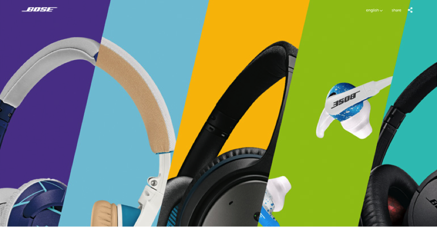
This site is focused on headphones. Trying to cover more products would overwhelm a user, and if that were the goal, a full-blown website would be the better approach. However, for exploring one or two things in depth that you would like to draw attention to, the Bose microsite is an excellent model.
Eldorado Stone
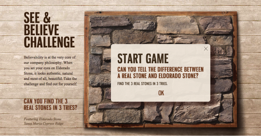
This site has a powerful, interactive design that makes the user feel in control of the experience, for instance by taking part in a quick game. This simple gamification technique makes a good lead for the page, as it arouses curiosity before getting into relatively dry features and product benefits.

This site uses powerful imagery to maintain and guide user attention as people scroll down the home page. Notice the copy is kept to a bare minimum on the home page and interior pages to make scanning easy.
Over to You
What microsites do you think are well designed? Any design tips to share?