
The Importance of User Experience in Lead Generation
If users cannot figure out how to use your website, or how to find the information they need on your website, your conversion rate will suffer. This is where the art and science of user experience (UX) come into play.
Eliminate Confusion
While there are many new and really cool ways to design your website, not all of them are good for the user. When push comes to shove, using widely accepted Web standards over new and cool technology is almost always the way to go. Why? Because users already understand how to use a website and people like what is familiar. Forcing them to figure out a confusing new UI just for the sake of being different is a mistake. This website is an example of one that looks amazing … but makes it difficult for users to figure out what to do.

Information Architecture
Make sure your website pages are organized in a way that makes sense for people outside your organization. Group similar pages together so users can figure out, without too much effort, where to find specific information. When users have to guess where information is, they will click off your site — sales opportunities are lost.
Clean Design
Don’t be the guy with 100 different competing calls to action on each page. It is critically important not to clutter your site with too much stuff. Instead of throwing in everything but the kitchen sink, determine the one or two main things you want a user to do on each page and stick with that. Here is an example of a nice, simple, clean design: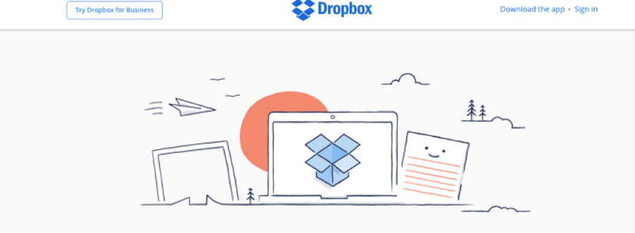
Here’s a website with a horribly cluttered design:

Compelling proof that less is more when it comes to UX! The Dropbox site has very limited options for users to click, and they follow a logical flow. The second site has so many links a user could spend several minutes deciding what to do, or more likely, deciding to do nothing at all.
Clear and Concise Calls to Action
Is it crystal clear to the user what you want him/her to do next on each page of your website? Study the New Relic design:
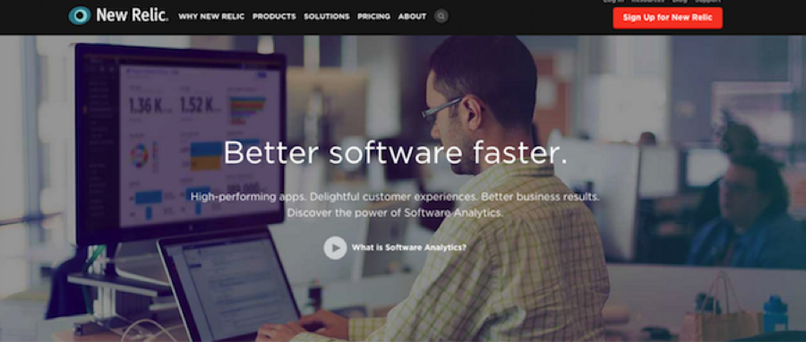
The sign-up button appears prominently in the upper right corner of every page. This is a great way to keep your primary call to action (CTA) on every page and no more than one click away from wherever the user is. Very smart.
Think About Mobile Users
You must consider mobile users when designing your website, because what is important to them is sometimes quite different from what a desktop user wants. Striking a balance can be challenging, but here are the key issues:
- First and foremost, use a responsive (mobile-friendly) design, so mobile users won’t have to zoom and/or horizontally scroll to read about your company.
- Can the mobile user quickly find your phone number?
- Is the phone number linked so users can click on it to make a call?
- If you have more than one location, is it easy for mobile users to find each one?
- Can mobile users get to your contact form in one or two clicks?
- Is the contact form designed for easy use on a mobile phone?
If you cover these six bases, you will probably be ahead of most, if not all, of your competitors in mobile UX. What’s more, considering the explosion in mobile Internet access, having an edge in this area could help you capture an enormous number of mobile sales leads.