Website Strategy
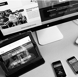
Do you have a strategy for your company website? Website development strategy and planning are what make the difference between a website that generates leads and one that makes little or no contribution to the bottom line. Strategy and planning for a responsive (mobile-friendly) website encompass eight areas, which are reviewed here.

1. Keyword Strategy
All lead generation websites start with keyword strategy. If the website's page naming, navigation structure, URL structure, internal link structure, body content, title tags and META description are optimized for the wrong keywords, the website will deliver little or no organic traffic, or non-relevant organic traffic; either way, few if any organic leads will be generated.
Keyword strategy is a specialized and complex Internet marketing discipline that matches a company's products and services to search terms people are likely to use when looking to purchase them. Keyword selection considers a number of variables, including user intent (usually, terms are selected that suggest an interest in making a purchase), search volume, competitiveness of the keyword, and how the company currently ranks for the keyword.
The keywords selected through research become the foundation of the site map, which drives the navigation structure and content requirements for the new website.
2. Site Map
The site map is a formal outline of all website pages, and how they will be organized. A great deal of skill is required to produce a site map that balances search engine optimization (SEO) requirements, user experience (UX) and internal descriptive conventions.
The site map is one of the most critical phases of a website project as it lays the foundation of the entire project. The website page hierarchy is used to create and identify pages that are needed to target specific keyword groups for SEO. It serves as the base for content by acting as a legend for what pages need inputs and what content structure will be required for each page. The site map also guides the creation of the navigation and internal link structure along with what pages need keyword optimized title tags and META description tags.
A company's internal system for describing and organizing its products and services sometimes conflicts with SEO and UX. For instance, a company may describe its products with branded terms that are unfamiliar to search engine users, whereas on the new website, downplaying those branded terms and using more common terminology will make it easier for both search engines and human visitors to identify the products they are looking for.
Another extremely important consideration for website development strategy is making sure the site map is scalable. Often, a new website launches with a smaller number of pages than what is ultimately envisioned. A good site map accounts for phase 2 and phase 3 content additions, so that when the time comes, the website doesn't "run out of room" to add new top navigation items, additional product groupings, etc.
Request A Free Consultation


3. Client Collaboration Meeting
At this stage of website strategy and planning, an intensive client collaboration meeting is timely. In addition to reviewing the keyword strategy and resolving site map issues, the client and agency should discuss milestones and timelines for the website development project, assign responsibility for tasks and determine how communication will be handled. These discussion points, which may seem rather tedious, are actually vital to create a successful website. A website development project involves a great number of people on the client side and agency side. If communication is slow and has overlaps or gaps, the quality of the final product suffers — and just as important, bad feelings can easily arise.
To elaborate on that last point, relationship building is another powerful benefit of an intensive client collaboration meeting. The more people get to know each other, communicating effectively and overcoming challenges or disagreements become easier. A truly successful website project is one that not only delivers a high-quality, effective lead generation website, but also ends with all participants enthusiastic about the project experience.
4. Determining Main Template Pages
If you look closely at just about any business website, you will notice that each page is not unique in terms of layout. Instead, page templates (design shells) are created for various groupings of pages. Page templates have two major benefits. First, they reduce the cost of the new website by reducing the amount of design work required; second, they enhance UX by providing visitors with a predictable pattern for similar pages, making knowing where to look for specific pieces of information easier.
The number of templates for a given website varies depending on the nature of the client's business and breadth of content. Typically, separate templates are used for the home page, product/service pages, company pages and the blog(s). Identifying the appropriate templates is critical, because upcoming stages of the Web development strategy will take shape around the selected templates.
5. Designing Style Tiles
Style tiles give clients and agency Web development team members a sense of the new website's look and feel. Conceptually, style tiles are similar to what an interior decorator might do to convey a concept for a new kitchen by showing the client pieces of wood flooring, cabinetry, backsplash tile, countertop and paint that will comprise the redecorated room.
For website development strategy purposes, style tiles depict color schemes and font styles for various content elements, imagery style (e.g., black and white versus color photography), background colors, and design for conversion elements such as call-to-action buttons. Essentially, style tiles are a visual representation of a website page without any specific layout or content.
Client reactions to a style tile range from, "This doesn't feel like our company at all," to "This is exactly what our site should look like!" The important thing at this stage is not to achieve immediate perfection, but to shape the style tiles until they reflect the visual branding the client is seeking. However, if the earlier discovery phase of the Web development project has been conducted effectively, the agency design team has a pretty good sense of what fits with the client's brand, making this phase very smooth.
6. Creating the Content Inventory
From a Web development point of view, one of the biggest changes that has come about due to responsive (mobile-friendly) design is the need for a content inventory structured for each page template. A responsive website works by "shrinking" page content to fit a mobile phone screen by stacking content vertically in a predetermined order. In the old, desktop-only days, content could be thrown down on a page in any old way. But with responsive design, each content element must have a designated space on the page, enabling content elements to be rearranged for different size screens.
Content inventory elements include top-level navigation, a search bar, breadcrumb navigation, sidebar navigation, logo, footer, page title, introductory content, secondary content, graphical calls-to-action and images. Clients should review content inventories in two ways: first, to make sure all necessary content elements are included; and second, to help the agency determine the proper ordering of content elements for mobile screens. For instance, should images appear above or below secondary text on the product page template? The client may also feel certain content elements, such as lengthy secondary text, need not be displayed in the mobile view at all.

7. Content Reference Wireframes
After receiving client input on the content inventory, the agency's next step in strategy for the website is to create an in-browser content reference wireframe, a visual depiction of the content inventory for several page templates, but with the important additions of navigational and responsive functionality. This step allows the client to get a feel for how the page will look when it "shrinks" to fit a mobile phone screen, as well as to test navigation to see if it is intuitive and logical.
Content reference wireframes do not contain original content or design elements. They are better thought of as schematics or blueprints that will become the underlying foundation of the eventual website. When clients review content reference wireframes, they may modify their thinking about the ordering of content elements, and on occasion, a different approach to navigation may be required. However, if the agency is well versed in best practices for UX and Web design — which it should be — and uses a solid strategy process as outlined here, tweaks rather than major overhauls should be occurring at this stage.
8. Rough Sketches
The final step in the website strategy is creating rough sketches. Typically, but not necessarily, pencil sketches or drawings made on a device with a special app, rough sketches are a Web designer's somewhat detailed depictions of what a page template will look like in desktop and mobile view.
In a rough sketch, the designer creates the page layout strategy, allocating specific amounts of page territory for imagery, text, navigation and other content inventory elements such as breadcrumb navigation and the footer. The designer must also consider how content elements will "break" when a page shifts from desktop to mobile view. For instance, will text size be readable on a small screen, or will call-to-action blocks lay out coherently on a small screen? Rough sketches are far from the final word on page design; refinements, sometimes significant, occur during the actual design phase of the Web development project. However, rough sketches give the design team and the client an opportunity to address major design issues well in advance — a tremendous advantage in terms of preventing costly and lengthy delays due to major design changes later in the project.
More and more, Web designers are starting with the mobile layout, and working "backward" to the desktop layout — a reflection of the surging growth in mobile Internet use. This may represent a major shift in thinking for clients accustomed to concerning themselves exclusively or primarily with their website's desktop appearance. If the client seeks sales leads or e-commerce revenue from its new website, mobile-friendliness must be given high priority.
The strategic work described here should not be thought of as extra time. By mapping out the website strategy in advance of design and development work, the project timeline should actually move more quickly. To the extent content, design and functionality are thought through in advance, copywriters, Web designers, front-end developers and even back-end developers can focus on execution rather than trying to figure out what they are trying to accomplish. The end result: a new company website that launches more quickly, and delivers more sales leads.
Talk to the website strategy experts today! Call us at 855-779-7675 or request a quote.