Simple Things Every Website Needs To Succeed
As the title of this post states, below you will find a list of simple things every website needs to succeed. You might think a lot of this is common sense (and rightfully so), but you would be amazed at how many people overlook these items. Their website performance will suffer heavily because of it.
1. Easy-To-Find Contact Information
Sometimes, finding a phone number or a contact form on the site is like embarking on a Holy Grail expedition.

I feel like Indiana Jones going deeper and deeper into the bowels of a website trying to find out how to contact the company. Obviously, this is a waste of time. Put your phone number in the upper right corner of your website, just like everyone else does. There is a reason for this — it’s a Web standard and you should follow this standard on your website, as well. Have two phone numbers? Include them both. Have a bunch of locations? Include location page links, as well.
If you don’t want people calling you, at least include an obvious “Contact Us” link and take the user to a form. By making this difficult for users to locate, they won’t contact you and your website won’t succeed.
2. A Well-Structured Site Map
Information architecture is one of the most important foundational steps when building a website. This determines how easy (or hard) it is for users to find what they are looking for on your site. The theory is simple: organize information (in this case, pages on your website) in a way that makes sense. Group similar pages together, and put them under categories that are easy to understand. Name pages so anyone can understand exactly what that page is about. Don’t be cute. Don’t use branded or trademarked terms as page names. Stay away from industry-focused terminology and buzzwords as page names. Don’t put pages that belong in one category in another.
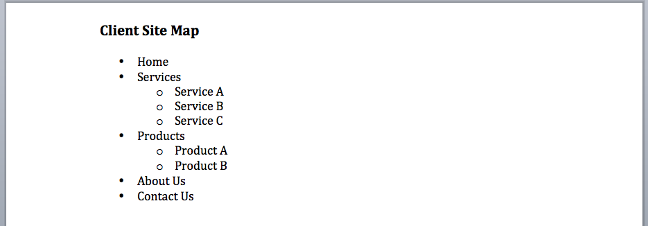
Easy right? Not so fast. This is a major place we spot a lot of issues when working with sites we did not develop. The best way to think about a site map is this: Assume that the person coming to your site has no idea who your company is or what you do. Assume he has no idea about your industry. Assume he is a 6-year-old boy. You might think I’m kidding, but approach the site map of your website as if a child will use it. This will prevent you from making the structure of your site more difficult than it needs to be.
3. Easy to Use UI (User Interface)
I spoke a bit about this in a previous post and it’s just as relevant in this one. The UI of your website is easy to overcomplicate with so many competing priorities, but you’ll find much better results with a simple, standard website layout.
Sticking to a clean, modern design that is focused on getting the user to the information he needs with as little resistance as possible is the goal. A wise man, Steve Krug wrote a book titled “Don’t Make Me Think.” While this book was written about 15 years ago, its teachings are just as important today as they were the day it was written. I recommend that any Web/UI designer read this book, immediately. Here is one of many great images from the book that clearly shows a user’s thought process when navigating a site’s UI.
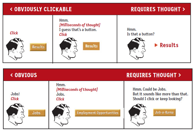
It’s easy to get caught up in a lot of the current design trends and new techniques that can be done in your browser, but overcomplicating your website with new interface ideas that users are not familiar with can lead to a decrease in user efficiency. Users end up spending more time trying to figure out how to work your website, rather then learning about your business and/or contacting you. If they get frustrated enough, they will simply leave your site and you’ll most likely never hear from them again. A recent report from the Nielsen Norman Group illustrates many of these points — it is definitely worth a read.
4. A Fluid Layout
With more and more website traffic coming from mobile devices (both tablet and smartphone), a responsive website is a must-have in today’s world. There is nothing worse than going to a website on your phone and having to pinch and drag the home page to find what you’re looking for. Don’t even get me started on trying to click navigation links to interior pages. You will likely mash several tiny links together with your index finger and then who knows what page you’ll end up on.
Don’t frustrate your users with an outdated, fixed-width layout. If you don’t have a responsive site right now, its time to get that resolved as soon as possible. This ties directly with point No. 3 (about ease of use). If your site is built with a fluid layout, that layout will adjust to fit the screen size of any device your users are viewing it on. This means, users can navigate your site easily and without frustration. When providing a pleasant experience, navigating and reading content on your site will improve the chances of that user converting to a sales lead — it’s as simple as that.
5. No Flash!
If I wrote this post five years ago, this would be at the top of the list. However, today, it’s becoming much less of an issue. It’s still worth mentioning, though. Whatever you do, under any circumstances, do not put any flash animation on your website.
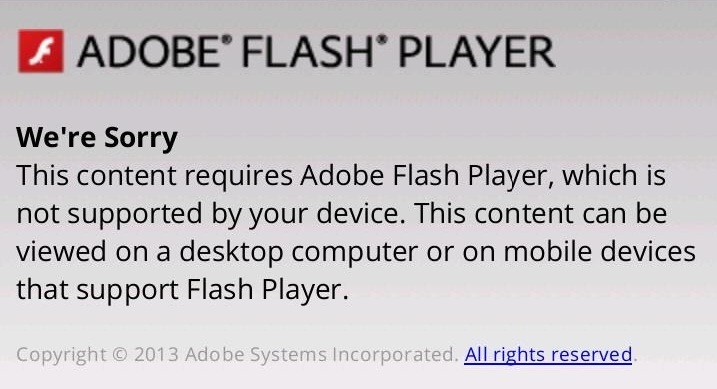
Not only will it not work on any Apple phone or tablet (which could encompass a huge chunk of your users), as seen in the screenshot above, it is old, clunky and full of security issues. Additionally, if your user doesn’t have a flash plugin installed on his browser, he will have to spend time installing one. Because of this, he might never make it back to his original goal of trying to contact a company like yours.
None of the above items are complicated. If you are undertaking the design and development of a new site, or simply making updates to your current site, keep these simple items top of mind. You’ll be steps ahead of the competition.